Andrew Rea Design LLC
Graphic Design and Branding
for Marketing, PR and
Business Development
Marketing Campaigns
Graphic Designers rarely design “one-off pieces.” Most projects have multiple pieces that work across various media. These pieces need to be coordinated in their messaging, yet unique to their individual purpose. What follows is a partial sample of what Andrew has done in this area.
Lancab Brand Development
Logo.
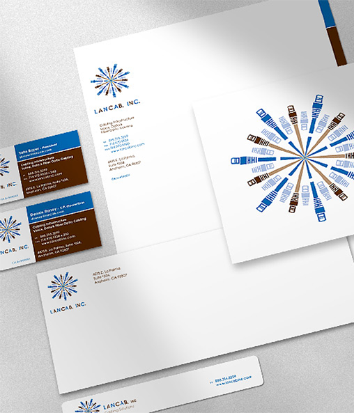
Stationery System.
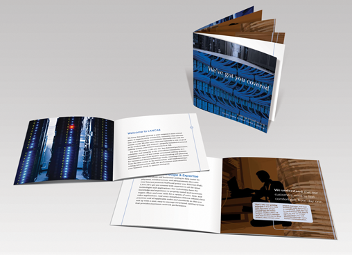
Brochure.
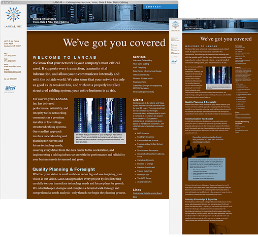
Brand Development for LANCAB, a consultant and installer of corporate computer networks. Using the most basic elements of their business to create a simple, clean, professional brand throughout their print and web media.
SBLC Branded Campaign
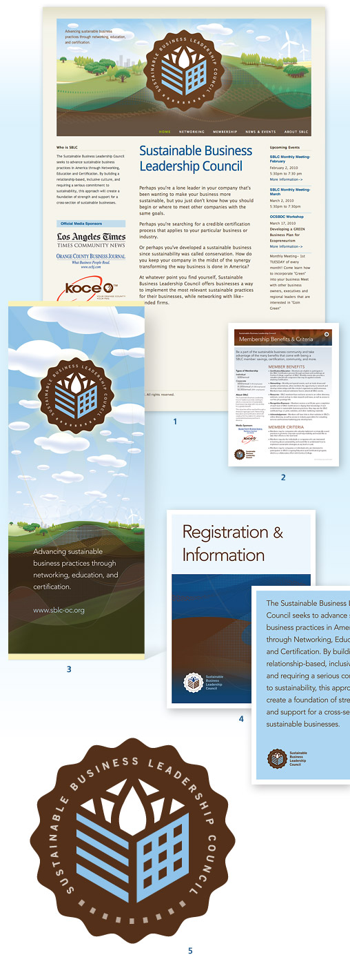
1. Website, 2. Various Informational Collateral, 3. Vertical Event Banners, 4. Event Posters, 5. Logo.
A branded campaign for Sustainable Business Leadership Council (SBLC).
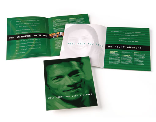
pension planners recruitment campaign
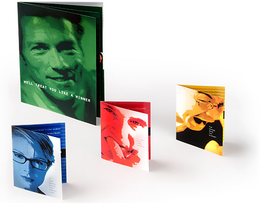
The direct mail portion of the campaign included three self-mailers with a perforated BRC and a follow-up brochure within an enclosing folder.
Pension Planners wanted to find independent financial services professionals who were energetic, dynamic, and ready to take their careers to the next level.
To recruit these professionals, a campaign based on popular game and reality shows (with prizes) was created. The campaign included an informational brochure with an enclosing folder, three direct mail brochures, and a website.
Follow-up brochure within an enclosing folder.
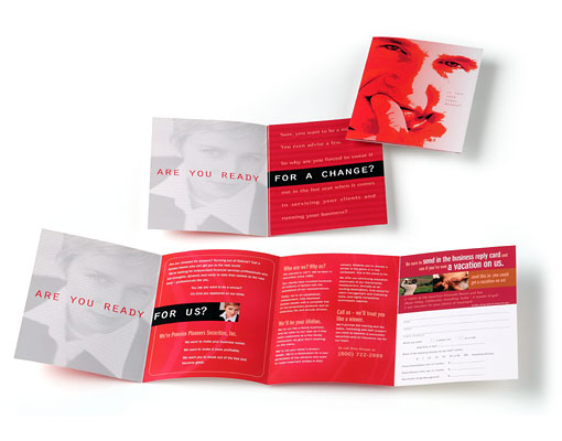
The direct mail portion of the campaign was a series of 3 self-mailers with perforated BRC panel. The design took advantage of the barrel roll configuration of the brochure to reinforce the theme of the campaign—“Are you ready for a change… Are you ready for us?”
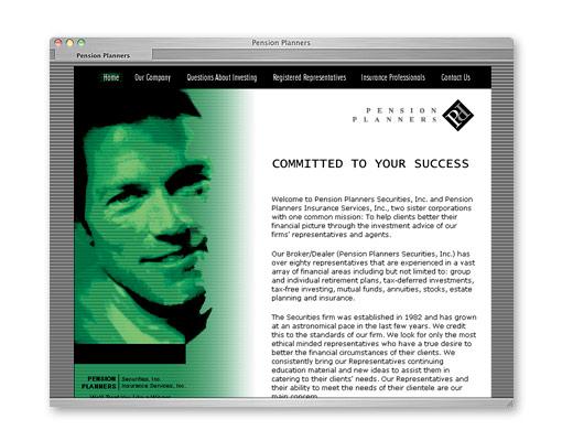
Web micro-site continuing the look and feel of the direct mail campaign. The site reinforced the message from the direct mail campaign.
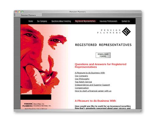
The site allowed Pension Planners to address and track issues of interest to financial advisors. In addition to answering questions, the site made the transition process even easier with downloadable forms.
Peter Montoya’s “A Brand Called You,”
Branding University Seminar
Logo for seminars.
As part of a larger brand, these branded seminar events derived their look and feel from elements of the larger brand (which Andrew also designed). The entire package included a unique seminar logo, environmental banners, signs for various uses, name tags, table tags, collateral materials, apparel, a PowerPoint presentation, and a CD-ROM premium.
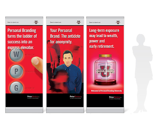
Banners were used throughout the entire seminar space.

Logo embroidered on a baseball cap. The cap was used as a premium for the event.
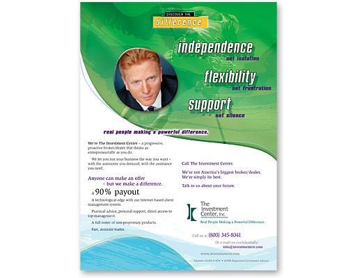
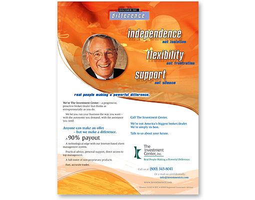
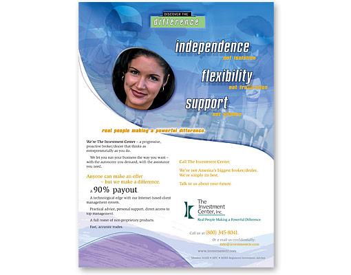
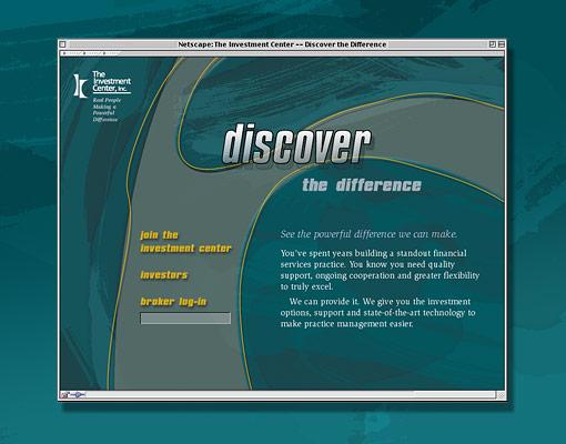
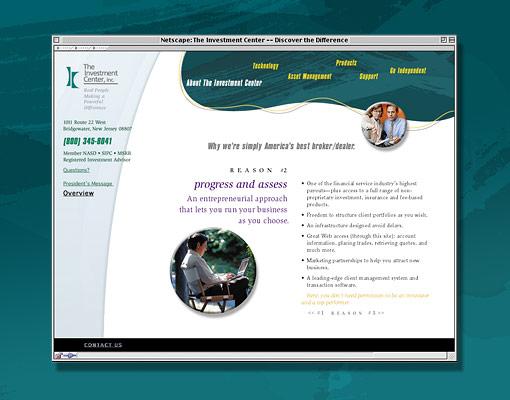
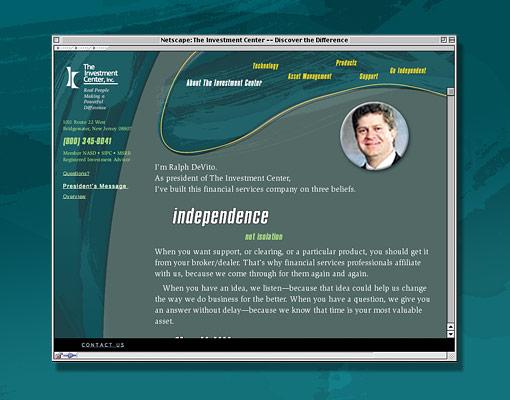
The investment center recruitment campaign
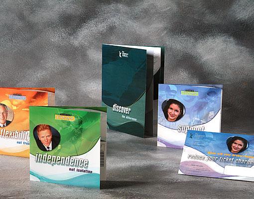
The print and direct mail portion included: 3 direct mail brochures, 1 direct mail postcard, and a follow-up informational brochure with an enclosing folder. The bold colors and graphics made this campaign stand out and reinforced the message of “Discover the Difference.”
The Investment Center wanted independent financial services representatives to “Discover the Difference.” They were seeking financial advisors who were tired of the same old broker/dealer relationships.
To attract these professionals, a bold, dramatic campaign was created. The campaign included a informational brochure with an enclosing folder, three direct mail brochures, a direct mail postcard, a comprehensive website, and three trade ads.
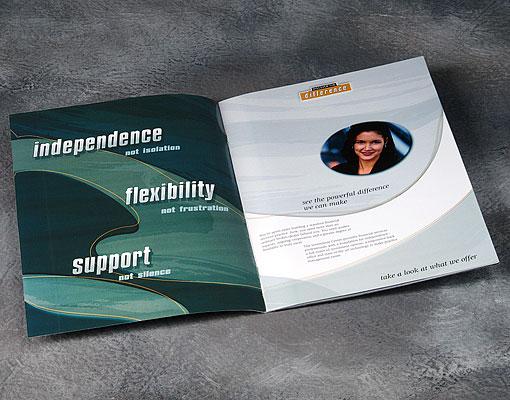
Interior of informational brochure. This piece was sent out to prospects who responded to the call to action in the direct mail campaign and/or the trade ads. The layout is consistent with the rest of the campaign; however, the color scheme is derived from the Investment Center corporate palette. The two color schemes were designed to complement each other.
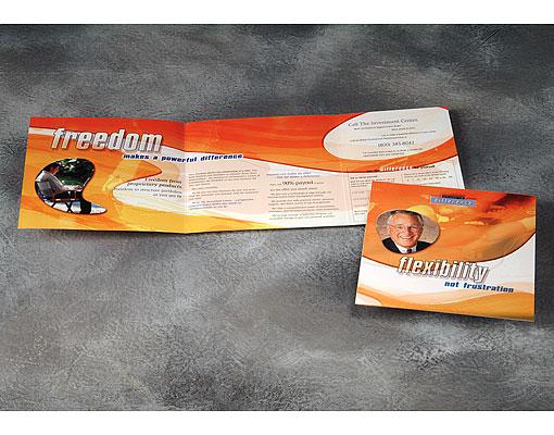
The cover and interior of one of the direct mail brochures. The brochures included a tear-out BRC.
The Advertising portion of the campaign ran concurrently with the direct mail campaign. The ads appeared for three consecutive months in Registered Rep, as well as Financial Advisor magazine.
In addition, the campaign also had a Web presence. The website allowed interested prospects to find more detailed information regarding The Investment Center and its opportunities.
sigma financial corporation recruitment campaign
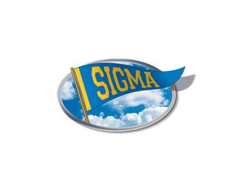
A custom emblem based on a football pennant was created for the campaign.
A small independent broker/dealer in the Midwest needed a new recruitment campaign. In the past they had sporadically used football and football memorabilia as a theme, and with this campaign it was turned into a full fledged marketing strategy. Football was front and center for Sigma’s “A Winning Team” strategy.
The campaign included: an emblem mark for the campaign, a 3 card postcard campaign, a follow-up direct mail brochure, and a trade ad.
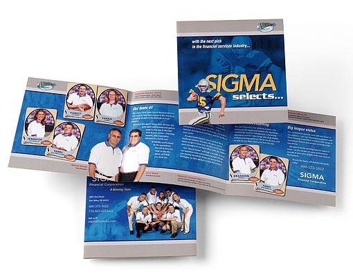
Direct mail brochure. Cover, Interior and back cover.
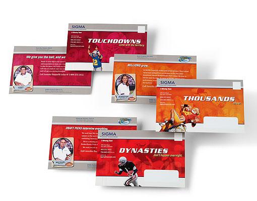
Three-card direct mail campaign.

Trade ad featuring eight-time Pro Bowler Will Shields of the Kansas City Chiefs and client of Larmer & Associates. Larmer & Associates uses Sigma Financial as its broker/dealer.
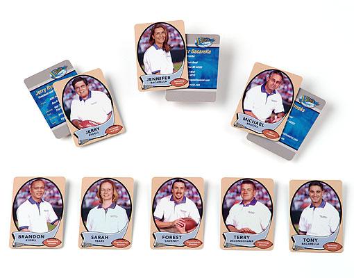
These business cards were not part of the original campaign, but as the creative for the campaign evolved it seem like a natural. A comp was created for the CEO and presented to the client. The client loved it and had cards made for all the top personnel.
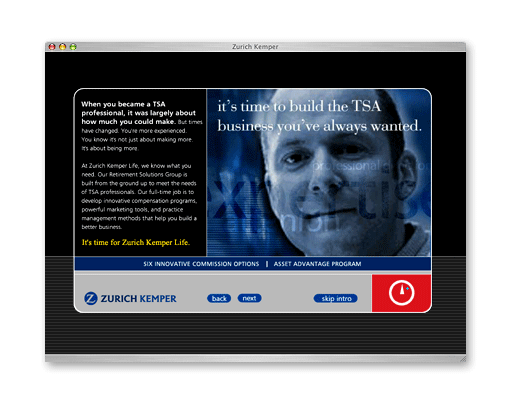
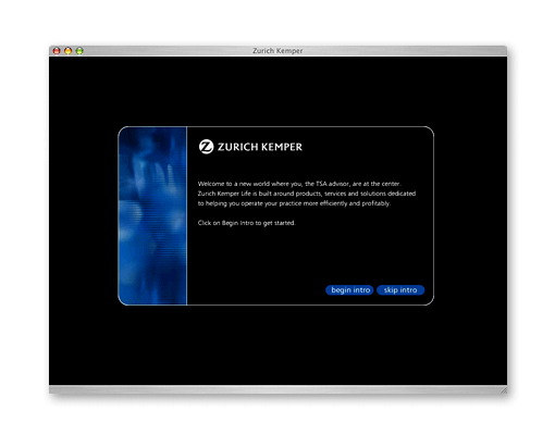
zurich kemper life recruitment campaign
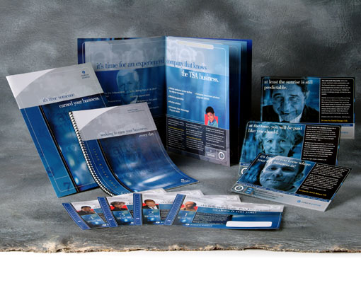
The campaign included a 12 card direct mail postcard campaign, a follow-up brochure with an enclosing folder, a custom digital booklet for prospective agent on-site visits, and a website.
Zurich Kemper life (now just Zurich), an insurance-based financial services company, was looking to recruit new sales professionals. The campaign theme was “It’s time for Zurich Kemper Life.” Large images of people with key words layered on top and behind anchored the campaign, while the color scheme incorporated Zurich’s corporate color palette.
Website

National Planning corporation recruitment campaign
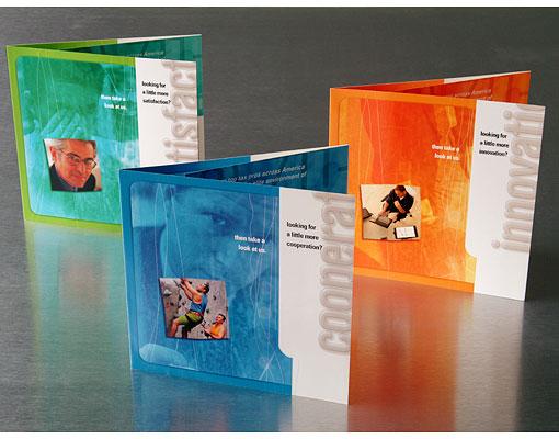
To keep the mailers fresh yet familiar, the layout grid remained consistent throughout the series while the color, imagery, and copy changed.
A recruitment campaign using bold, bright colors, lots of texture, and provocative imagery to attract financial professionals looking for an “elite relationship.” The juxtaposition of the bright colors, raw texture, and color photography played up the contrast between the prospects’ current dissatisfaction with their broker/dealer and what they could have at National Planning Corporation.
The campaign included three self-mailers and a trade ad.
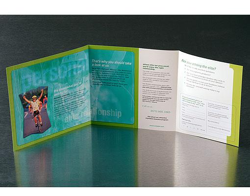
Mailer interior. Each mailer had a BRC.
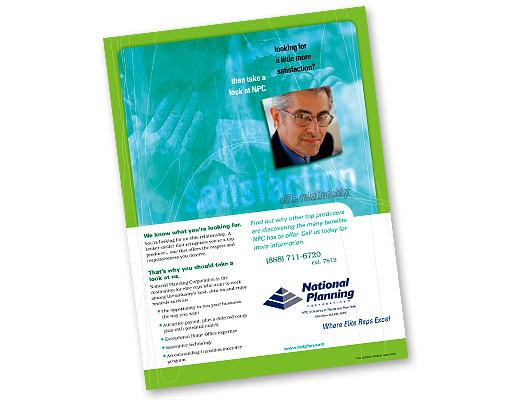
Trade ad.
IMs cpa’s ’ associates sales campaign
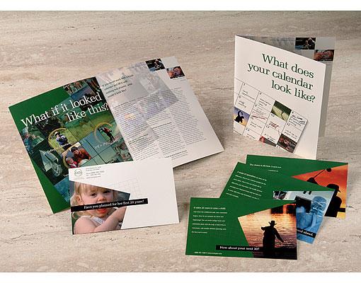
The promotional campaign included 4 direct mail postcards and a follow-up brochure.
This CPA firm wanted to expand its services into financial planning. A promotional campaign was created to attract young professionals who were too busy building their careers to deal with planning for the future. A calendar theme, along with forward looking images and copy, propelled the narrative forward.
Design Sustainability?
About Us
ARD offers high quality graphic design and branding – emphasizing sustainability to upscale marketing, public relations and business development firms for their savviest green clients.
Our creative process releases us to follow the trail of energy, water and material resources to anticipate every opportunity to design sustainably.