Andrew Rea Design LLC
Graphic Design and Branding
for Marketing, PR and
Business Development
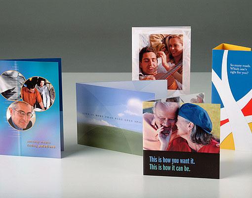
Brochures
Even in an electronic world, brochures are still the only tangible demonstration of your company’s values that your clients can hold in their hands. It doesn’t require an Internet connection or a Wi-Fi hot spot. It’s extremely portable. It has a well understood interface and navigational structure. It’s always “on.” A brochure can provide scale and context that sometimes gets lost in our “Googlefied” world; and finally it provides a tactile experience that the Web simply cannot reproduce.
Lancab
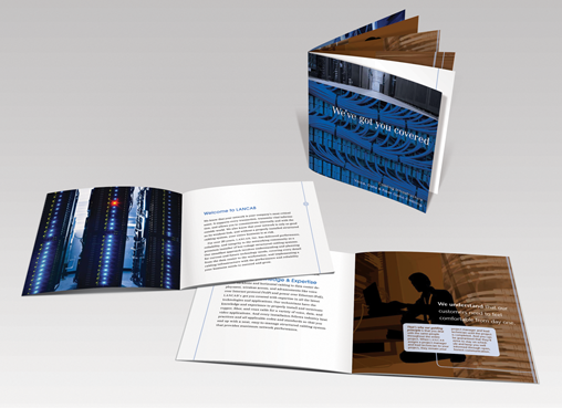
Brochure.
Let’s face it, cabling and network installation is not the sexiest business to be in, but a bad cabling installation can cost a company millions. That’s why LANCAB, as a consultants and installers of corporate computer networks, wanted a promotional brochure that could explain their services, in a clear, organized, and professional manner. Both the content and the visuals reassured potential clients that LANCAB had the experience and expertise to install it right, the first time.
merrill lynch Asset Management “grasp” brochure
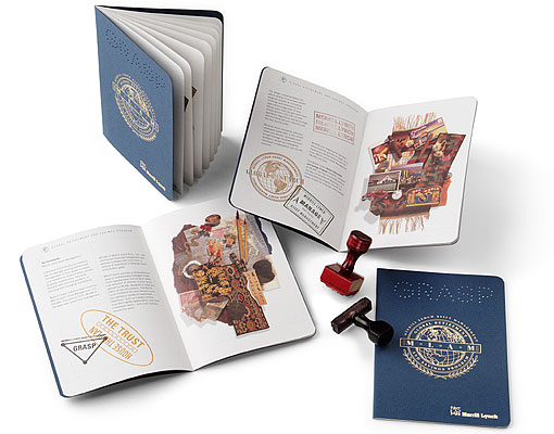
MLAM GRASP brochure.
This brochure was used to promote MLAM’s new Global Retirement and Savings Program (GRASP), a program for non-U.S. citizen employees of U.S. corporations.
The passport design represented Merrill Lynch’s commitment to seeking investment opportunities around the world for their clients. Their research was from their “on the ground” presence, as opposed to a research report.
Design elements included custom die work on “GRASP,” custom foiling, texture paper throughout, still life photography with objects from different areas of the globe, and custom stamps created that mimicked customs agents stamps. The stamps reinforced GRASP’s message to its prospects.
Bowne Business Communications capabilities brochure
Bowne Business Communications capabilities brochure: front cover and interior spread.
Interior spreads.
Bowne Business Communications wanted to redefine the classic printing paradigm of Quality, Price or Speed – pick any two. To promote this idea, a capabilities brochure was designed to present five apparently paradoxical assumptions about commercial printing and how they could be overcome. The design used word play and visual juxtaposition to express this new paradigm.
metlife semi-custom brochures
Semi-custom brochures for five different market segments: Retirees, Pre-Retirees, Young Achievers, Family/Small Business, Women Investors.
MetLife wanted its financial advisors to be able to market its services to potential customers. However, it didn't want its advisors to stray from MetLife’s central branding message and it didn’t want to police hundreds of advisors to make sure guidelines were being followed.
To solve this problem, five market segments were identified and then brochures were created to address the specific needs of that segment. The individual advisors could then add some personal information and a photograph to the brochure.
As a result, the advisors were able to connect with a specific target market and MetLife was assured that the advisors’ marketing was consistent with corporate standards.
vantage financial partners limited
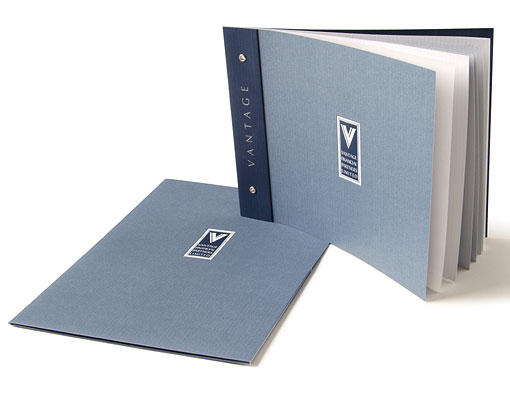
Brochure and folder exterior.
Catering to “C” level executives in the Chicago area with wealth management issues, Vantage Financial Partners wanted a sales presentation that was understated, sophisticated, and classic. At the same time it needed stand out from its peers. The piece needed to communicate a high level of stability, trust, and expertise.
These objectives were achieved visually with subtle, yet unique features: grommet binding with “swatch book” wrap-around cover, vellum flysheets and textured uncoated sheets inside; and embossing, foiling, and creative use of spot colors and spot varnishes on the cover and enclosing folder.
The result is a design that is clean, understated, and elegant. Read the case study.
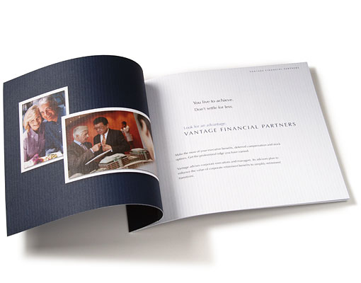
Brochure interior spread.
Brochure and folder interior. The folder pockets are taller than normal. This allowed for a clean presentation of the brochure, as well as a large presentation of the client logo in a clear varnish. The folder and brochure working together allowed Vantage to present timely information with consistent brand messaging.
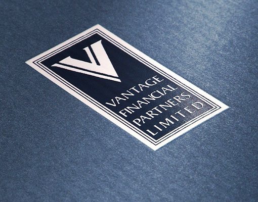
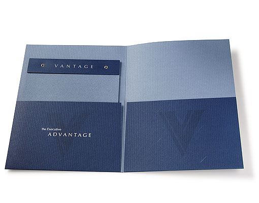
Detail of the logo that appears on the cover of the brochure and folder. The panel was de-bossed; then a white matte foil was applied for the background with a blue foil overlaid on top. The logo needed to be modified slightly to foil properly.
The Financial Services Network Promotional Brochure
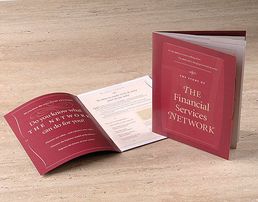
A “storybook” theme was developed for the Financial Services Network promotional brochure.
The Financial Services Network wanted its compelling story to drive and inform the design. The idea of the “storybook” evolved from that premise. At the same time it wanted a corporate look. To accomplish both objectives, typographic elements (i.e., initial swash capitals and ornamental decorations), subtle graphic shapes and creative use of clear varnishes were use to give the suggestion of a storybook, but still keeping the piece within the realm of a corporate brochure.
Cherry Bekaert & Holland promotional brochure
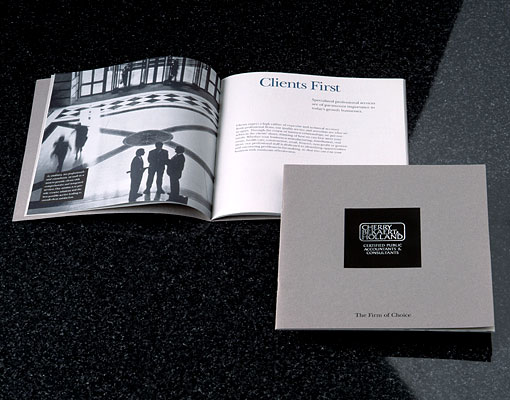
This subtle, yet distinctive design set Cherry Bekaert & Holland apart.
Subtle values of grays and blues, duo-tone photographs, high quality uncoated paper, and sparse typography gave this brochure for Cherry Bekaert & Holland a distinctive quality that set it above its peers in the accounting field.
accountants financial alliance (afa)
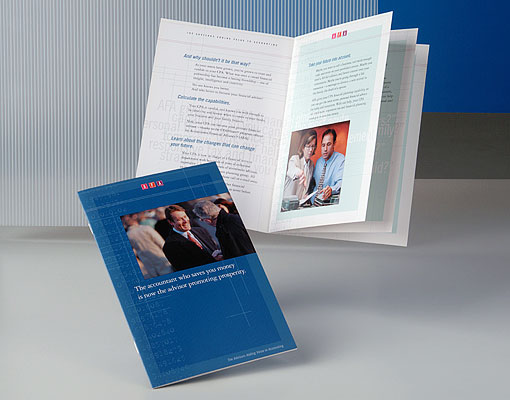
The cover and an interior spread. The design is a deconstructed ledger book.
Accountants Financial Alliance provide a turnkey solution for CPAs who want to offer financial advice to their clients. The brochure told prospects about AFA, what AFA could offer clients through their CPA, and the nature of the CPA-AFA relationship. The brochure design itself was based on an accountant’s ledger book – the paper, the ruled columns of numbers – which was then deconstructed.
Design Sustainability?
About Us
ARD offers high quality graphic design and branding – emphasizing sustainability to upscale marketing, public relations and business development firms for their savviest green clients.
Our creative process releases us to follow the trail of energy, water and material resources to anticipate every opportunity to design sustainably.